6 colours perfect for your lounge


Living rooms are the ultimate space for comfort and relaxation. As our lives have transformed over the past few years, so has the way we use key spaces in our home.
Achieving that all important work life balance is crucial for well-being and the colours you use in your lounge can enhance your down time.
Tranquil Blue
Blue is the perfect colour for evoking calm and serenity in your space. Dark blues can provide a grounding feeling in a warm space, whilst sky blue can create a real uplifting feeling without feeling over-energised. Baby blues create a similar energy to sky blue in a subtler way, evoking a soft and gentle feeling. Lastly, turquoise blue contains hints of green which combines the feeling of growth and serenity which creates the perfect space to read or relax.
Off White
Choosing an off white is a great choice when you want to optimise the feeling of spaciousness and introduce a sense of purity. Lighter colours are known for their light reflecting properties and are often the first choice when choosing a new colour for your walls.
Off whites will generally have undertones of another hue and so the key for a beautifully put together scheme is to choose an off white with the same undertone as other colours within the space.
Finding the right white can be tricky as there are thousands to choose from. Painting some samples onto lining paper and placing them on every wall in the room will allow you to see how the white interacts with the light and existing colours in the room.
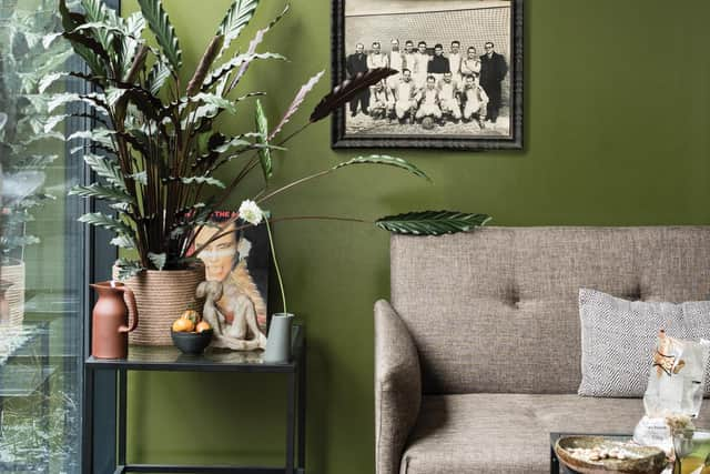
Green
As you have probably seen, greens are everywhere right now. Connecting your outdoor space with your indoor space is simple and a great way to evoke feelings of growth and renewal. Soothing and reassuring, green is a great colour to introduce into your lounge.
Light green paint colours can create a real traditional feel in your home if you want to aspire to a country modern look, whilst vibrant greens can add a fun and fresh feeling. Dark greens can create a more sophisticated backdrop.
Earth Colours
Earth colours contain very natural colours such as browns and warm neutrals. This creates a strong cocooning feel, as if you're all wrapped up in the space. All of life stresses can be left at the door as you walk into a room enveloped in natural bliss.
Pale earth colours are the perfect alternative to magnolia, which is a soft easy way to create relaxation in your space, whilst richer browns add an extra level of warming indulgence to a room.
Combine with neutral greys, soft pinks or light purples to add a new sense of energy to the scheme.
Opulent Colours
Create a luxurious feeling in your lounge with colours that scream opulence. Rich colours such as teal, indigo, mulberry, and sunny yellows create a lavish, maximalist look that shows your appreciation for bold colour. This is a great way to inject some personality in your space which can be further enhanced with the use of bold wallpaper.
Lilac
Lilac is becoming a fast favourite with designers as it is great for adding bright, optimistic energy to a space. If you socialise in your lounge frequently, consider using lilac as a way to encourage a renewed sense of self and let the conversations flow.
Periwinkle is another colour from the violet family that has more of a blue tone. This colour promotes serenity, peacefulness and comfort. Combine with berry shades to create a harmonising palette which is totally on trend for 2022.
Plan your next decorating project with the Brewers Project Box.
Save 20%
You can get 20% off your first purchase with a Brewers card message and it’s so easy to get a card – simply call 0800 031 9115 quoting NW20 or go to brewers.co.uk/